
Zero Budget Book Covers
I’m going to preface this by saying that I don’t know how much use this is actually going to be to people. I started writing this article yesterday and stopped once I reached a certain point (which you’ll see in the text that follows). I intended this to be a useful “how to make a cover on zero budget” article, but in picking it back up today to finish everything off I’m reading back through it and largely the advice boils down to “gather some resources until you have an idea for a cover, and then draw the cover”. I had originally intended to try and put something together from free assets like stock art and public domain art, as I’ve done in the past, but that’s simply not my normal workflow anymore. In hindsight I should have made sure that I made it my workflow for the purposes of this article rather than just sitting down and drawing some art.
I also want to make it clear that while I am in the strictest sense a professional at this – I do all my own layout and cover design and I also, from time to time, am paid to do it for other people – I am by no means an expert. I’m entirely self taught and that inevitably means that I very likely have some bad habits and don’t know some things that will seem obvious to real pros. So keep that in mind.
I’m still publishing this anyway, because it seems a shame to have done this work only to let it languish in a GDrive folder, but go into it knowing that it’s possibly not as useful as I wanted it to be. In a couple of weeks I’ll revisit it and try to put together something that’s a bit more actionable for people. In the mean time, I hope this is at least an interesting peek behind the curtain into my process.
Earlier this week I wrote this thread about the format of A Dungeon Game and The Moss Mother’s Maze and how switching from A5 to B-format dictated some decisions that I’ve had to make in layout. In it I talked about this format choice being inspired by the pulp horror and fantasy novels that I grew up reading, and that the cover art I’m making for these books is also inspired by vintage pulp paperbacks.
I also mentioned that I don’t have an art budget for any of my projects and that I’ve had to learn to do art, cover design, etc. myself. A couple of people said that they’d like to hear more about doing this sort of stuff with no budget and very little artistic ability, so I figured it’s as good a time as any to write about it.
This isn’t the first time I’ve written about these sorts of things. Back in 2017 when I was active on the DMs Guild I had even less of a budget than I do now. I wrote a few posts about doing art and layout on a budget that are still available on the site. I haven’t revisited them in a while, but I suspect that there’s probably still quite a lot of relevance to them.
Today is the day I revisit those posts. I’m going to make a cover for a project that doesn’t exist. My aim is to use as many free or budget friendly resources as possible. I might draw some things, I’ll probably use some public domain or stock imagery. At the time I’m writing this I don’t actually know what I’m going to do, because the only way I’m ever able to document this sort of stuff effectively is to start writing before I’ve started doing the work. (Part of me thinks that I should screen record the process but that feels like adding additional pressure onto the experiment. We’ll see what happens).
The first thing I need is a title. I’ve literally just finished playing my Wednesday OD&D game and the session ended in a massive brawl as we fought off 62 zombies (it was very fun, dungeon crawling is great, I highly recommend it). I’ve also been listening to Comeback Kid today (when have I not?), in particular the best hardcore song ever written, so we’re going to call this book Wake The Dead. We’re also going to assume it’s an adventure for A Dungeon Game, and therefore needs to have a visual style that matches the books in that game line. Let’s take a look at them before we do anything else.

Let’s go left to right, top to bottom, and talk about what these are. Top left is the cover for The Moss Mother’s Maze. This is the first adventure for A Dungeon Game and depending on when you read this is either about to be released, or is already extant.
In the middle is the cover for the game itself. This was the first thing I made for this game, and is going to dictate the visual style of everything else I release for it. Everything has to look like it first with this cover in some way.
On the top right is the cover for an adventure called DRAGON that only exists conceptually. I made it before Moss Mother was even an idea, and you can see that it hews much closer to the cover for A Dungeon Game than Moss Mother does. If I’m being completely honest, I probably won’t end up using it once I write that adventure.
The two covers on the bottom row look quite different to those on the top row. These are two small pamphlets I’m going to be sending out with Moss Mother. I wanted them to look like a matching pair, evoke the style of the books in the core line, but also stand out a little. It was less important to me that they feel as consistent with the overall line as the adventures, but I still wanted it to make sense that they’re from the same line, if that makes sense? I don’t know how successful I was with that, but I know that I like them. (Of all the covers in this image, DRAGON is the weakest in my opinion).
So let’s start by identifying some common features that are going to help things feel consistent in the cover for "Wake The Dead". We’ll ignore the pamphlets and focus on just the top three covers in that image. The pamphlets follow some of these rules but also break some of them.
- All of these books have a square grid on them. For the adventures, it covers at least three fifths of the page space. (A Dungeon Game and Dragon are roughly 65% grid/35% no grid; The Moss Mother’s Maze is exactly 80%/20% and I prefer those proportions).
- They all have a logo in the top right corner. DRAGON uses the Loot The Room logo, as does A Dungeon Game, but Moss Mother uses the dragon from the cover of A Dungeon Game that I’ve been using as a logo for the game itself. If I were to revisit DRAGON I’d replace that LTR logo with the dragon head to brand it as part of the game line.
- Text is set in ITC Avant Garde Gothic and "a dungeon game" never uses capital letters.
- All the artwork uses simple lines and shapes, relatively flat colours, and a fairly limited palette.
Those are the constraints I’m working with – or at least, the touchstone elements of our design brief. Now it’s time to gather some references. I have a couple of places where I’m going to look, and I’m not going to allow myself to spend more than half an hour on this:
- My go-to website at the start of any layout or cover design project is Fonts In Use, and I’m going to have a quick browse there to see if anything jumps out at me.
- In the thread I linked at the top of this article I also posted a photo of a specific book from the Pan Book of Horror Stories, which were hugely formative for me. Since this adventure sounds like it could be a horror adventure I’m also going to look at covers from that series and see if there’s anything that jumps out at me or inspires me. There’s a great website that showcases the covers of these books, so I don’t have to hunt for them – and I’m definitely going to browse the rest of the site to see if there’s anything else I can borrow from. How can I resist when the website is called ‘Trash Fiction’?
- The cover for The Moss Mother’s Maze was heavily inspired by Saul Bass’ cover designs, so I’m going to look at some of them again as well.
(This is the point in writing this article where I stop what I’m doing, go away and do an hour of research, and then come back here and keep writing about it like no time has passed whatsoever. In the interests of transparency I’m going to keep an eye on the clock for this little project, because while this is "cover art with minimal budget" the trade off when you do things yourself is that you need to be able to give your time to it. I started writing this article at around 14:30. Let’s see how much time I’ve spent on this by the time we finish.)
Here’s the reference board I’ve put together, followed by notes I made as I was adding each image to it. (Some probably got missed and don’t have notes, and that’s fine.)

- 16th Pan Book of Horror Stories. I like the skeleton breaking the frame. I deliberately broke the frame of the maze on Moss Mother – could this be a theme?
- Our Mother’s House. I like the way the type is stacked above the line.
- Ghost Omnibus. Similar to Our Mother’s House, I like the typography above the image.
- The Giant Stumbles. The squares are interesting. This could be a way to point to the grid without using the square grid. But possibly this would be a choice for a release a year or two into the product line, when I’ve already established a consistent visual language.
- The Hollow Sunday. There’s something really striking about that massive title dominating the page.
- Carmilla & The King In Yellow. I like the band across the middle of the cover that breaks the images up. Earlier I mentioned the proportions of the gridded/non-gridded parts of the cover. This could be a cool way to change it up so that the grid isn’t exactly the same as Moss Mother.
- The Man In The Maze. One of many covers from the ST Rediscovery series. This is a good example of templating, where they all use the same frame and just change the colours and the image. I don’t know that there’s anything directly inspiring or useful here, but I liked this enough to save it and add it to my reference board anyway.
- Scientific American. Another big typographic cover. The texturing on the lettering is very cool.
- An Honest Living. Probably my favourite thing on this board. I love that weird rectangular spiral pulling our eyes into the centre of the frame, and the colour palette is great. It needs good images to work and I don’t know that I have anything like that yet, but right now this is setting my brain on fire for this cover. This reminds me a lot of Saul bass, especially the album art for Anatomy Of A Murder, which I’m now going to grab and put on my board as well.
- The Colossus. Every single time I come to Fonts In Use I look at this cover. One day I’m going to figure out how to make use of this idea.
So that’s my reference board. Now I need to start thinking about what this cover is actually going to look like. It’s usually my hope that once I’ve gathered some references I’ll also have some ideas. Right now I don’t have much, but luckily we can start putting some elements in place that we know are going to have to be there – like the grid, and the logo.
Let’s go through this as step by step as possible.
The very first thing I’m going to do is set up my blank document at the right size. B-format is 127 x 203mm and I print with 4mm bleeds for softcover, so my document is 135 x 211mm and then I add drag some guides onto my canvas to show me where the bleeds will be.
The next step is to add the grid that’s going to form the background of our image.
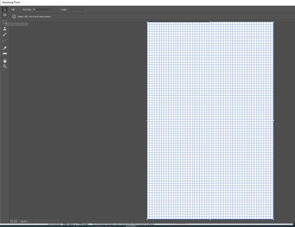
The quickest and easiest way to do this is to go to Filter > Vanishing Point, double click the "Create Plane" tool in the top left, and then go to the dropdown menu (immediately left of where it says "Grid Size") and click "Render Grid To Photoshop".

This places a very ugly square grid on a new layer. Later we’ll play around with the colours of it but for now, it’s in place and that’s all that matters. I also want to change my background colour. It’s easy and obvious to go for black but I want something different. I can’t really decide what, but since this is called "Wake The Dead" and since lots of A Dungeon Game comes from AD&D 2nd Edition I’m going to go and grab a screenshot of the zombie from that game’s Monstrous Manual and just start stealing colours.

I grabbed some colours, masked out the top 20% of the grid, and then realised that I’d left a perfect space to put a big header in. Deciding to finally give in to my urge to do something similar to ‘The Colossus’ I started putting vertical bars in from the feet of each letter. There’s probably a much better and more professional way to achieve this than the way I did it, which was to grab the marquee tool and draw a little box descending from each foot and then fill it with white, but I don’t care. I used the transform tool to extend the boxes down, intending them all to hit the bottom of the page, but I realised that because each rectangle I’d drawn was a different size they were obviously stretching to different sizes and I actually really like the effect. Here’s what I’ve got right now.

This is rough as hell right now but something about those falling white bars has a Saul Bass element to it, entirely by accident. So I think we can lean into that and start thinking about having something silhouetted in front of it, and maybe build up and illustration that these bars can fall behind. I still want that verticality, I want to be able to see that they’re all different heights, so it can’t fill too much of the space, but we’ll see what happens.
This is my favourite part of designing a cover, because I’ve gone from having no real idea what I want to do to a pretty strong direction in a very short space of time.
Pulp covers tend to lack subtlety. It’s part of their charm. My instinct when making something called "Wake The Dead" is to resist leaning into classic imagery of undead stuff – graveyard and grasping hands and zombies. But I think here it’s worth leaning into it. Especially as we’re dealing with silhouettes, I think the bottom of this image could be something like a graveyard or a small chapel on a hill. Skeletal trees look really good in silhouette and are easy to draw, so that’s a nice option for me when I’m working with no budget and relying on my own artistic abilities. Maybe there’s also a setting sun happening that can intersect with these descending lines in an interesting way? I’ll have to change the colours around, but that’s fine.

I sketched in some ground and started putting in the trees. Again, this looks like nothing right now. The ground is actually two layers – one that slopes down from left to right and one that slopes from right to left, with them meeting somewhere in the middle. That’s to leave myself options. I might make the slopes a little more pronounced so that we get a nice valley in the middle, depending on what the subject of my image ends up being.
Stray thought as I look at this – I may possibly get rid of the trees and have the bars descending from the letters be gnarled like branches. Another possibility is that they could end in inverted crosses, rather than putting any crosses on the ground graveyard-style.

I added more to the trees but there’s just too much going on here. It’s too busy. I’m going to scrap them and we’ll see if I can do something interesting with those bars instead. I think what it needs is a figure in that valley (which is now steeper) and some sort of building – maybe a small chapel?

I grabbed some colours from my reference board for new backgrounds and started making a chapel out of shapes. The the roof in place I can draw the rest of the building in so that it’s not a perfectly uniform shape. I’ve also adjusted my guides to split the page into thirds so I can position the chapel in a way that’s pleasing.

Selecting all the bars, I’ve painted over them with a watercolour brush. I want them to fade and fall apart as they descend. The next step after this is to deselect them and start hitting their vertical edges with a watercolour eraser to break up the shapes a little, as seen above.
This is starting to come together, but it needs more stuff going on around the chapel. A lot happened in a very short space of time, so let’s take a look at where I ended up after 5 or 10 minutes’ more work:

I grabbed that Trees layer I drew earlier, smashed the two halves together into one tree, and shrunk it down to fit next to the chapel. Then I took a small brush and painted some birds in the sky.
I decided that I wanted the sky to be red, with a giant setting sun behind the chapel (to give us a reason for everything to be in silhouette). The sun is the same colour as the sky previously was, and that red for the sky is pulled straight from the same image – Saul Bass’ Anatomy Of A Murder cover.
The sun itself is literally just an ellipse with a solid fill. On the layer behind it I painted in a glowing halo with a very, very transparent watercolour brush, building it up in layers. Then I drew in some wispy shapes to indicate clouds on a mask layer over the sun, and added a few thin orange wisps to try and sell the effect a bit more.
At this point I stopped for the day at 17:30. (One of my main rules now that I work for myself is that I’m going to keep healthy hours.) This cover is now at a point where it just needs some final tweaks to make it really come together and start to pop. Looking at this again with fresh eyes, I have a small list of things I want to do:
- I hate the tree. The tree is getting replaced with a better one.
- The big black mass of ground needs something to make it more visually interesting. Maybe it’s a figure, maybe it’s headstones, maybe it’s just some highlights like the sun is catching the ground as it sets. I don’t know, but I’ll experiment.
- The white bars need breaking up a little bit more. There are some sections – particularly where they join the letters – that still look a little flat and boring.
- I don’t love the orange wisps coming off the sun. I think I can make them better.
Once that’s done I’ll add some texture to the image as a whole to give it that "vintage book" feel, which is something I have a specific process for, but we’ll get to that.
Let’s start with the white bars, since they’re a big job. Working on mask layers I spent some time roughing up the edges and distressing them with various watercolour and rough ink brushes, trying to give them a bit of movement and also have them blend more seamlessly into the text. Partway through the process I also decided that I wanted them to have the texture of bandages, so I Googled "royalty free bandage texture" because this is how we find stock images. I tried a few different ones and ended up settling on this image from Adobe Stock – which isn’t free, admittedly, but I had some credits and made use of them. Honestly, though, if I’d spent a little more time hunting I definitely could have found a free texture that would have got the job done, because it’s barely noticeable in the final image.

I dropped the bandage texture onto the canvas and selected both the text and the white bars, then used that as a mask. The blending mode is set to Multiply – some people know exactly what each blending mode does and can pick the exact one they need to get the effect they want. I’m not one of them, so I just scroll down the blending modes until I find one that works in a way I find pleasing. Then I used an old trick I learned in audio production for mixing that I regularly make use of when blending textures. I dropped the opacity to 0%, so I couldn’t see the texture at all, slowly pulled it up until it became visible, then dialled it back down a couple of %. The effect is that the texture is visible enough to be impactful and register with the viewer, but still subtle enough that it doesn’t jump out at you screaming I AM A BANDAGE TEXTURE.
Next up, the tree. I spent some time searching for a free vector of a "spooky tree" that I liked but none fit the space in the way I wanted, so I drew a new one. While I was working on it, zoomed in really closely, I decided that I wanted to add some highlights to the chapel as well to give the impression that the sun is catching the edges as it sets. I’m pretty bad at picking colours, so I used my old standby – Colormind. I gave it the hex codes for the orange and red that I’m using and refreshed a few times until I found a yellow that I liked. (Is yellow the right colour for this sort of highlighting? I don’t know. Do I care? Absolutely not.)

The highlights on the chapel were easy because they were straight lines, I decided I want the tree to have some too, so I used to wand tool to select it and then nudged the selection a few pixels to the left. Now I can paint inside that selection and have a nice uniform width to my highlight.
The next and most important step is figuring out what to do with all that foreground. I really am resistant to putting in headstones and crosses, because that feels tacky. I want to evoke vintage pulp but not go head-first into Halloween Decorations, if that makes sense.

I spent half an hour trying to figure out what to do about the foreground without actually adding anything, but while I was mulling it over I took another run at the sun. I prefer this version to the very flat previous version, and the straight lines for clouds (which are just a paint streak brush I have that I made as narrow as I possibly could) are better than the wisps I’d previously drawn.
I decided, ultimately, that what is needed wasn’t something additional in the foreground but instead to just fiddle with the balance of the image a little. The transition between Grid and No Grid was a little harsh and the grid itself was a little faint, so I darkened it up and added a slight gradient towards the top to make less of a hard boundary. While I was thinking about gradients I idly wondered how it would look if the background faded from the original purple I took from the AD&D Monstrous Compendium into the red and I was pleasantly surprised to find that it pulled the image together in a really pleasing way.
I added a few more birds in flight, slightly bigger to vary the weights and make them more present, and I licensed this image to sit in the D of Dead. I don’t know how I feel about that particular addition, but I’m going to leave it there for now. This brought the total cost of this cover to $14.99 plus my time and my ongoing Adobe Stock subscription.
The next, final step is to add some texture to the image. The texture you see on the cover of A Dungeon Game is Infinite Pulp from True Grit Texture Supply. The aged paperback texture on The Moss Mother’s Maze is from elsewhere, but this cover is already busy enough that I won’t be using that here. I don’t have access to Infinite Pulp on this machine, but Infinite Pulp 2 came out fairly recently so I’m going to pick that up for $30 just to have some similar textures I can use here.
The texture used on A Dungeon Game is called something like "Endpaper Rag". I was looking for a similar name as my starting point in the new set of textures and there isn’t one, but what there is is a texture called "Cloudy Sunrise". And honestly…

I immediately love it. The texture plus the way it mutes the colours make that gradient from purple to red really sell the sunset, and the texture on the ground adds a little bit of tonal variety to the foreground. I had to go back into the untextured file to move the yellow highlight behind the chapel and tree over a few pixels, because it got lost in the texturing, and while I was there I also made the horizontal arms on the title lettering a little thinner because they were so much heavier than the vertical strokes as a result me stretching it to fit the space. I also removed the crow silhouette, because I didn’t like it once the texture was on.
And that’s it. I’d be happy to put this cover on the front of an adventure, and I think it fits the guidelines for the A Dungeon Game line. We can test that by putting it next to the other books.

And just like that, we have a product line. All in all this cover took about 6 hours to put together from concept to final output, and that includes the time I spent writing this post while working. It cost $45 – that’s one stock asset I didn’t end up using, and a texture pack that I’ll use on multiple projects for years to come.
As I said up top, I don’t know how useful this bit of writing actually turned out to be because it’s a lot of "just draw the rest of the owl". But I hope this was at least a little interesting. There’s a big part of me that wants to now write an adventure to go with this cover, because I actually really like what I’ve come up with here!
If you got this far, thanks for reading. The Moss Mother’s Maze is currently available for pre-order in either print or digital editions and will release for real on June 26th. A Dungeon Game is, as always, entirely free, and the web version just got a massive overhaul. I’m biased but I think it’s really good, and I hope you’ll consider playing it.


June 20, 2023 @ 6:36 pm
Really useful post, thank you!
June 23, 2023 @ 9:24 am
You’re welcome, glad it was of some use!